We’re excited to share a small but powerful update to Galleryberg that gives users more control over how their image galleries look across different devices.
Galleryberg galleries have always been fully responsive by default. No matter how many columns you choose, the gallery automatically adapts to desktop, tablet, and mobile screens without any extra setup.
With version 1.0.8, we’re taking responsiveness to the next level.
What’s New: Responsive Column Controls with Device Selector
Galleryberg now lets you control column counts separately for desktop, tablet, and mobile devices using an intuitive device selector inside the block editor.
Instead of relying only on automatic responsiveness, you can now fine-tune your gallery layout for each screen size:
- Set more columns on desktop for wide layouts
- Reduce columns on tablets for better spacing
- Keep mobile galleries clean and readable with fewer columns
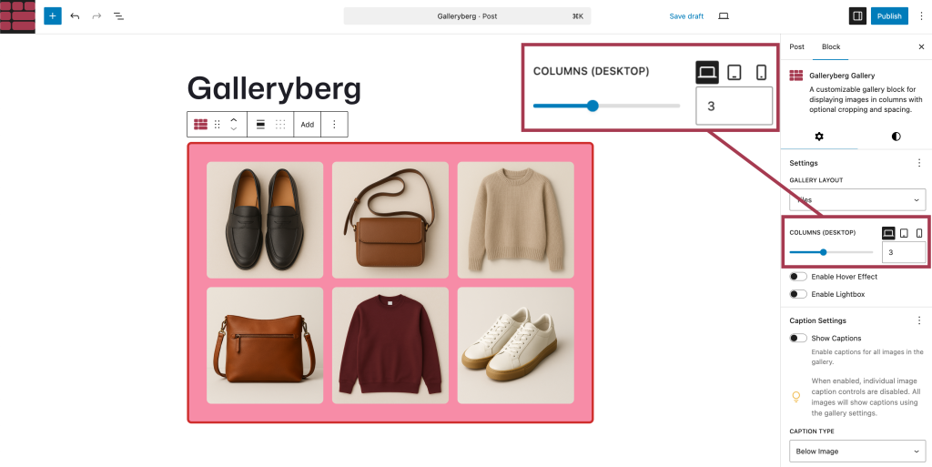
All controls are available directly in the Galleryberg block settings; no custom CSS or extra plugins required.
Why This Matters
While automatic responsiveness works well in most cases, real-world layouts often need a bit more flexibility.
This update is especially useful for:
- Photography portfolios
- Product galleries
- Blog posts with mixed content widths
- Sites where tablet layouts need special attention
You get the best of both worlds:
- Smart defaults for effortless responsiveness
- Manual control when you want precise layouts
Default Responsiveness Still Works
If you don’t touch the new responsive column controls, nothing changes.
Your galleries will continue to behave exactly as before—fully responsive and optimized for all devices. The new option is there when you need it, and invisible when you don’t.
Available Now in Galleryberg 1.0.8
The responsive column controls are available starting from Galleryberg version 1.0.8.
If you’re already using Galleryberg, just update the plugin and try it out in the block editor.
And if you haven’t tried Galleryberg yet, now’s a great time to give it a spin, you’ll love how simple and flexible gallery building feels inside Gutenberg.
Leave a Reply